
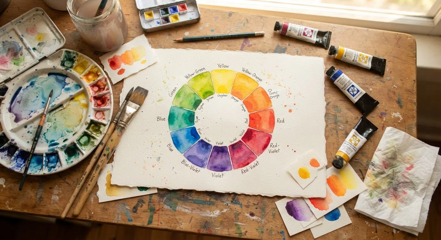
Primary, Secondary, and Tertiary: The Building Blocks
Think of the color wheel as a map. Once you know how it's organized, navigating color decisions becomes far less intimidating. At its foundation are the primary colors — red, yellow, and blue. These three hues can't be created by mixing other colors; they're the raw ingredients for everything else.
Mix two primaries together and you get a secondary color: red + yellow = orange, yellow + blue = green, blue + red = violet. Take a step further by blending a primary with its neighboring secondary, and you land on a tertiary color — think red-orange or blue-green. These in-between shades are incredibly useful for adding nuance and preventing a palette from feeling flat or cartoonish.
Understanding these relationships means you can predict color mixing outcomes rather than guessing — a game-changer for anyone who's ever ended up with an unexpected muddy brown on their palette.
Color Harmonies: How Artists Build Palettes That Work
The real power of the color wheel shows up in color harmonies — specific combinations of hues that reliably produce pleasing or intentional effects. Here are the most commonly used ones:
- Complementary: Colors opposite each other on the wheel (red and green, blue and orange). These pairings create maximum contrast and visual energy. Use one as the dominant color and the other as an accent to avoid a jarring clash.
- Analogous: Three or more colors that sit side by side on the wheel (yellow, yellow-green, green). This creates a cohesive, harmonious feel — great for nature scenes or calming compositions.
- Triadic: Three colors spaced evenly around the wheel (red, yellow, blue). Triadic palettes feel balanced yet vibrant, and they're popular in graphic design and illustration.
- Split-complementary: A base color paired with the two colors flanking its complement. This gives you contrast without the full tension of a direct complement — a softer, more versatile option.
Choosing a harmony before you start a project gives you guardrails. You're not limiting creativity — you're channeling it.
Hue, Value, and Saturation: The Three Dimensions of Color
Color isn't just about which hue you pick — it has three distinct dimensions that artists control simultaneously.
Hue is the pure color itself: red, teal, ochre. Saturation (also called chroma) describes how vivid or muted that color is. A highly saturated red is fire-engine bright; a desaturated red leans toward dusty rose or brick. Value describes lightness or darkness — adding white creates a tint, adding black creates a shade, and adding gray creates a tone.
Grayscale First: A Classic Artist's Trick
Before committing to a full-color piece, many artists create a grayscale thumbnail or underpainting to map out their value structure. This helps confirm that the composition has enough contrast to read clearly before color is introduced. It's a low-pressure way to catch problems early and is especially useful for beginners building their eye for light and shadow.
Many painting instructors emphasize that getting your values right is more critical than matching hues exactly. A composition with strong value contrast reads clearly from a distance, even if the colors themselves shift. This is why some artists begin studies in grayscale before introducing color.
Warm, Cool, and the Emotional Language of Color
Every hue carries a temperature. Reds, oranges, and yellows are considered warm — they evoke energy, urgency, warmth, and intimacy. Blues, greens, and violets are cool — they suggest calm, distance, and serenity. This isn't arbitrary; it's deeply tied to how humans associate color with the natural world (sunlight vs. shadow, fire vs. water).
Skilled artists use temperature contrast to create the illusion of depth. Warm tones tend to visually advance — they pop forward. Cool tones recede into the background. Painting sunlit surfaces with warmer tints and shadowed areas with cooler shades is a classic technique for making a flat canvas feel three-dimensional.
Even if you're not painting landscapes, thinking about temperature helps every creative decision — from choosing a background color for a digital illustration to picking yarn colors for a knitting project.